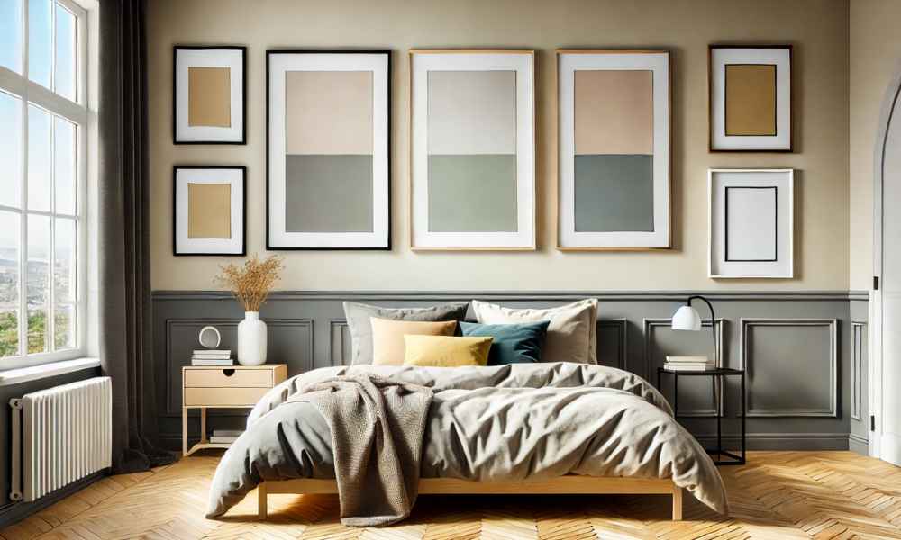
A blank wall presents a world of potential, an open canvas craving a touch of personality. Yet, the process of transforming that starkness into something eye-catching demands a blend of creativity and intention. One of the simplest yet most transformative tools at your disposal? The humble photo frame, arranged with precision and purpose. When you work with just three frames, you unlock a certain harmony—simplicity that doesn’t sacrifice versatility. Minimalist? Certainly. But when done right, these tri-frame arrangements balance artistry and structure, breathing life into your space. This guide will explore various design layouts and provide tips on curating your perfect three-photo arrangement. Photo Frame Wall Designs Layouts.
Choosing the Perfect Spot for Your 3-Frame Layout

The success of your wall design starts with location. Choosing the right spot isn’t just about finding a blank wall; it’s about selecting an area where the layout will complement the room’s energy and aesthetic. Cluttered walls fight for attention, so look for spaces that offer room for your frames to shine. Picture the living room—above a couch, in a hallway, or near the dining area. Even a kitchen nook could offer the perfect backdrop. The size of the wall should also be considered. Is it too small, making the frames feel overwhelming? Or too expansive, causing them to seem lost? A well-chosen location, coupled with thoughtful lighting, can make all the difference.
Classic Grid Layout for a Symmetrical Look
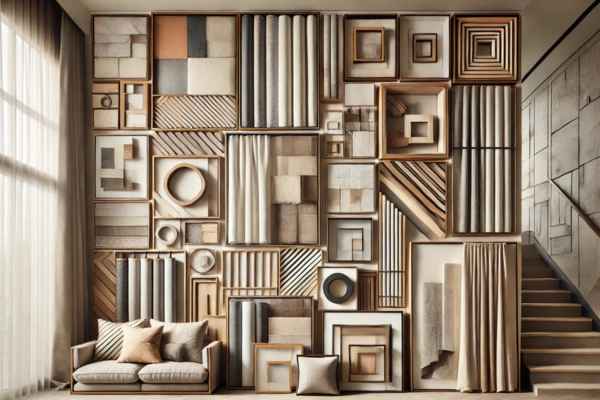
For those who crave balance and symmetry, the classic grid layout is a foolproof choice. A grid offers a sense of stability, where each frame finds its home within the neat confines of a structured design. The trick to nailing this look lies in precision—measure, then measure again. Equal spacing on all sides ensures that the frames line up perfectly, creating a cohesive, orderly aesthetic. This arrangement is particularly suited to a series of related images, such as black and white photographs, that tie together thematically, giving the entire design a unified feel.
The Vertical Stack for Narrow Walls
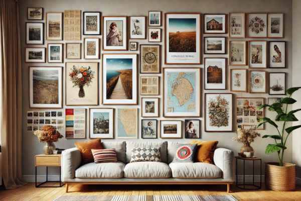
Narrow walls present a unique challenge, but they also offer an opportunity for creativity. A vertical stack elongates the space, drawing the eye upward and giving the illusion of height. Ideal for staircases, doorways, or narrow columns, this sleek layout offers a simple yet impactful design. The key is precision: each frame must align perfectly with the one below it to avoid a cluttered or chaotic look. A narrative series of images can enhance this design, creating a visual story that leads the viewer from frame to frame.
Horizontal Row: Expanding Visual Space
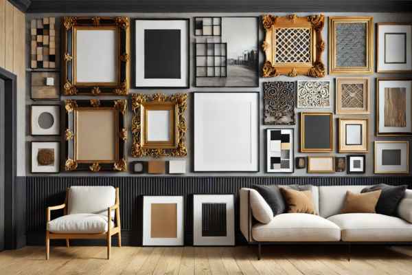
Your room craves width, a horizontal row layout will serve you well. This arrangement stretches across the wall, adding a sense of expansiveness to the room. Particularly effective above furniture, such as a sofa or bed, the extended line of frames harmonizes with the room’s proportions. When designing a horizontal row, the eye-level rule is paramount: placing the middle frame at eye level ensures the most natural and appealing display. Whether you’re working with landscape photography or abstract prints, this layout adds flow and balance to a wide space.
Experimenting with Asymmetrical Designs
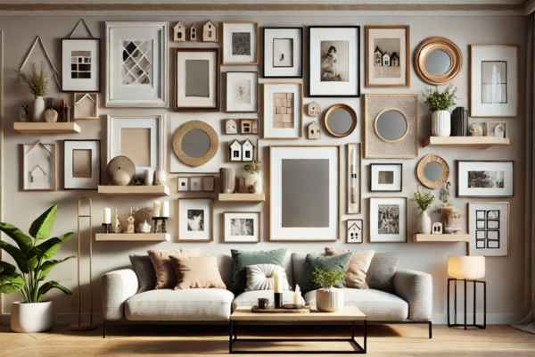
Asymmetry defies expectations, inviting spontaneity and creativity. It’s the art of breaking the rules—embracing the unexpected while still achieving a visually pleasing design. Asymmetrical layouts thrive on the contrast between large and small frames, bold shapes, and softer forms. Yet, there’s a subtle art to it. Though the frames might seem placed at random, the overall composition must still feel balanced, even if it defies traditional order. This playful aesthetic adds energy and movement to your wall, perfect for those who crave something a bit more eclectic.
Choosing the Right Frames for Your Layout
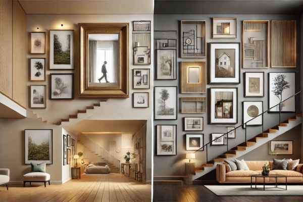
The frame is the vessel that holds the artwork, but it is also a piece of the art itself. The material, color, and style of the frames you choose will define the tone of your layout. For a cohesive look, frames made from similar materials—such as sleek metal or rustic wood—can tie the room together. Alternatively, mixing different styles of frames can introduce a sense of diversity, reflecting a more eclectic personal style. The color of the walls plays a critical role too. Dark walls might call for lighter, metallic frames, while light walls could benefit from deeper tones that provide contrast.
Incorporating Color and Texture into Your Layout
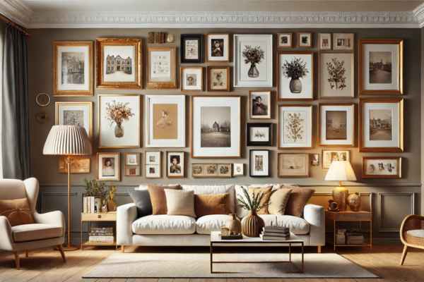
Color has the power to transform a layout from simple to sensational. It can be subtle, like monochromatic frames that let the images shine, or bold—vibrant frames that add a pop of personality. Beyond color, texture adds depth and interest. Think wooden frames for a cozy, rustic feel, or metallic frames for a more modern edge. If your photos are black and white, consider using textured mats or unique frames to introduce dimension and intrigue. The interplay between color and texture is what takes a simple photo frame arrangement and elevates it into something more.
Incorporating Different Art Mediums into Your Frames
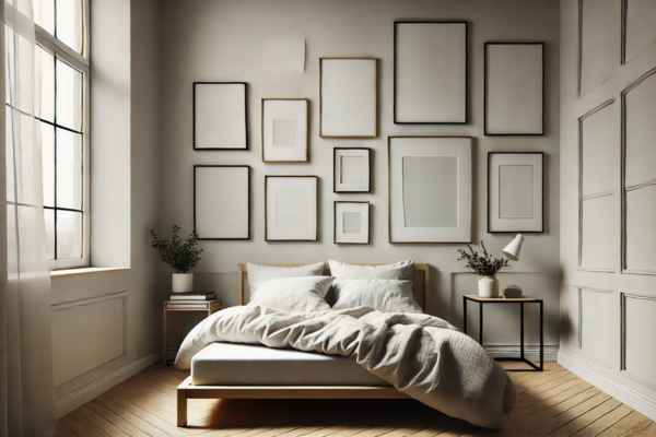
Who says photo frames are just for photos? Elevate your wall display by mixing mediums. Pair photographs with sketches, watercolors, or even fabric art to create a rich tapestry of visual storytelling. The trick to successfully incorporating different art forms lies in finding common threads—whether it’s a shared color palette or a thematic connection that ties everything together. Mixing mediums not only adds interest but also allows you to showcase a broader range of your personal style and creativity.
Lighting and Photo Frame Displays
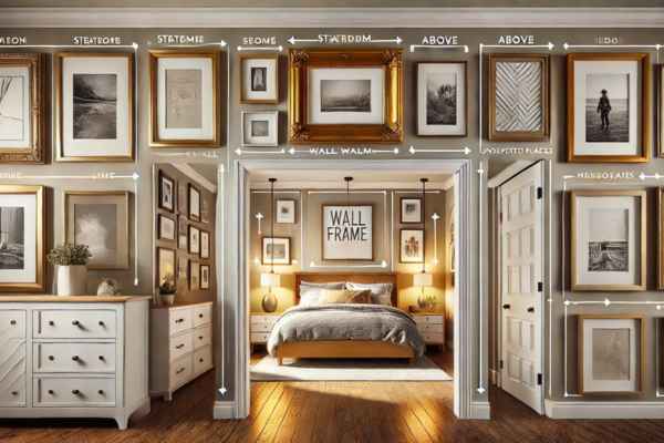
Lighting is an unsung hero when it comes to displaying framed art. A well-lit display can transform an ordinary layout into something extraordinary. Natural light during the day brings out the richness of the images, while accent lighting—whether through spotlights, picture lights, or sconces—can enhance the display after sunset. Be mindful of glare, however. Soft, diffused lighting works best to avoid harsh reflections on the glass. Thoughtful lighting can make your frames glow, turning them into the true focal point of the room.
Maintaining and Updating Your Wall Design Over Time
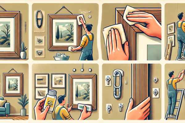
Wall displays aren’t static—they can and should evolve. Over time, dust and dirt can dull even the most striking layout, so regular cleaning is essential. But more than that, allow your display to grow with you. Rotate photos or artwork seasonally, swap in new images, or rearrange the layout altogether. By keeping your wall design fresh, you maintain its visual interest while reflecting the changes in your personal taste or the stories you want to tell.
Mistakes to Avoid When Designing Your 3-Frame Layout
Even the best-laid designs can go awry if you fall into common traps. One of the biggest mistakes? Misjudging space. Frames that are too close can feel cramped, while too much space between them can make the design feel disconnected. Another pitfall is hanging frames at the wrong height—too high or too low disrupts the visual flow. Keep the center frame at eye level for the best results. Lastly, avoid using frames that are too small for the wall, as they can get lost in the vastness of the space.
Budget-Friendly Tips for Creating Stunning 3-Frame Layouts
You don’t need to spend a fortune to create a beautiful photo frame layout. Many stores offer affordable frames that look high-end without the hefty price tag. Repurpose old frames with a fresh coat of paint, or shop for budget-friendly art prints online. Thrift stores are treasure troves of unique, one-of-a-kind frames that add personality without breaking the bank. With a bit of creativity, you can design a stunning layout that looks like it cost much more than it actually did.
Conclusion
Designing a 3-frame layout is an artful blend of simplicity, creativity, and personal expression. Whether you choose the balance of a classic grid, the vertical elegance of a stack, or the playful energy of asymmetry, these layouts allow you to transform any blank wall into a canvas of memories and artistic flair. Let the right frames, lighting, and personal touches guide you in creating a display that is both beautiful and meaningful.
